
© mmtfinland.wordpress.com
In a 2018 article entitled Three Shades of Yellow, I explain what synesthesia is — a condition in which one sense, in this case hearing, is simultaneously perceived as if by one or more additional senses, such as sight. I then add that although I do not have synesthesia, I often associate music with colours, sensations and images, and provide three examples of music works that in my opinion relate to variations of the colour yellow. The following article intends to develop on this concept and explain how I generally associate colours to music vocabulary — intervals, chords and scales.
While the synesthesia condition is natural, for most an association of colours relies on culture, knowledge and experience — a reference point — rather than inner-born sensations. The environment is therefore necessary to the development of the association, as well as perhaps a basic knowledge of music and how sounds are constructed; the intervals evolving to chords and to scales. The development approach is very similar to the one for perfect pitch — natural — and relative pitch — through education.
© Wikipedia
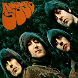
When learning to recognise music and notes, one often starts with intervals and their association with well-known music. For instance, a minor sixth can be associated with The Beatles’ “In My Life”, and to me it has always been associated with a dark green shade — perhaps because of the cover of the album Rubber Soul. A minor seventh is silver; perhaps because it is the Red Hot Chili Peppers’ “Can’t Stop” main motif and is a colour prominently featured in the song’s video clip.
© Wikipedia
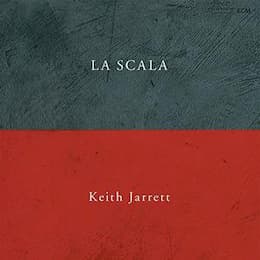
On the association of sounds with artworks, the minor major seventh chord — which is to me the sound of Keith Jarrett’s initial improvisatory motif in La Scala — is scarlet red. Some sounds, such as the one of the quartal chord — that can be heard in Miles Davis’ “So What” — relates to aluminium; perhaps because of the association of the intervals of a fourth, and the ambiguity and unresting quality of the chord, it seems very metallic and in a certain way cold.
When it comes to scales, the bebop dominant scale appears as yellow. It is a scale that sits between major and dominant tonalities, and I find it very bright and uplifting and adding interest to a piece of music. “Chromazone” by Mike Stern is of course a very good example of extensive use of this scale — or the chromatic scale for that extent. The harmonic minor scale, that derives from the minor major seventh chord, is associated with burgundy. I often think of Bach — BWV 847 for example. To me, a lot of Bach’s music is associated with this colour; historically, burgundy is a colour that was very prominent in the monarchy and the times of baroque music, and it makes sense to associate it with Bach. Contrastingly, Lully connotes colours that are a lot brighter — he was after all the musician of the Sun King.
This set of examples demonstrates the importance of the artworks and illustrations in recorded music; they do not only illustrate it, they allow the listener to associate visuals, and in this case, colours. The choice of images is very important, and some labels — such as Blue Note, ECM or Deustche Grammophon — have understood the impact of it on the listener’s subconscious.
© inkfish.fieldofscience.com
What is the purpose of associating colours to music then? It allows oneself to cross the senses and perceive music visually. For the creatives, it allows to take inspiration in visual works of art, and think in a different way; including colours and shades. For the listeners, it allows to understand music better by associating it with one of the senses that as human beings feel more comfortable with, sight. It is a very subjective approach of course, and it relates to one’s personal and individual experience.
")


