Scrolling through Twitter recently, this concert poster immediately jumped out at me:
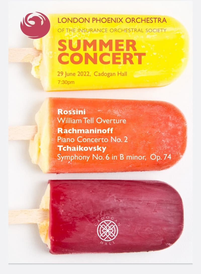
It’s striking, isn’t it? Not just the bright colours and simple design, but the choice of image which instantly says “summer” – appropriately, for a summer concert.
It’s also not a typical classical music image. There are no people in penguin suits, or conductors with wild hair, or women in evening gowns – indeed, none of those tired, cliched images all too often still associated with classical music. It’s immediately eye-catching, it contains the information you need, and the choice of the ice lollies instead of a more “classic” (as it were!) image might just attract people who might not normally choose to go to a classical music concert.
Working in the publicity and promotional realm of classical music, I am struck more often than not by how poor a lot of concert promotional material is – including by the big/important venues and promoters. It is a fact almost universally acknowledged these days that we live in a visual age; for advertising and marketing material – whether physical posters or flyers – or digital assets for online promotion, the choice and quality of images are pretty crucial. Yet time and time again I see poor quality, or simply bad, images, and, worse, inappropriate and/or illegible typefaces.
Today one doesn’t necessarily need to hire a graphic designer to create decent promotional materials. Easy-to-use design programmes like Canva offer templates and a wealth of images and other elements to help you create quality flyers, posters and social media posts, which are set to the correct dimensions for specific platforms, e.g. Twitter or Instagram (this ensures no chopped off heads or misaligned text etc).
In addition to high-quality images, choice of typeface is also important. Florid scripts may look pretty or artistic but think about how they translate to a flyer or poster. Are they easy to read? Largely, no. Another pleasing aspect of the ice lolly poster above is the clean typeface (something like Helvetica or Arial, I think). Note how a different weight (bold) of the same typeface is used to highlight the composers’ names. The final aspect which receives a big thumbs up from me for this poster is its simplicity: it contains the crucial information (though it could perhaps do with a website link and note of ticket prices).
That oft-quoted three-word phrase from architect and designer Mies van der Rohe (“less is more”) is as applicable to furniture design as it is to concert promotional materials. Too often I see posters and other materials which contain far too many words. Give your potential audience enough What Where and When information and trust them to do the rest by visiting the relevant website or calling the box office. There’s no need to tell them everything about that forthcoming concert…..
For more of the best in classical music, sign up to our E-Newsletter
Gioachino Rossini: Guillaume Tell (William Tell), Act I – Overture (Philadelphia Orchestra Pops; Eugene Ormandy, cond.)
")


